


.png)


.png?width=171&height=239&name=2025%20Trends%20Report%20Nav%20(1).png)


Originally published September 30, 2024
Every year before the holidays I like to weed out my closet and the various black holes of the house (we call them “identity crisis drawers”) in preparation for the seasonal influx of novelty teapots, cardigans and pocket-sized flashlights. It’s a good time to reflect on what I actually use, and cathartic to find new homes for the things that I don’t. More than a simple inventory of objects though, this ritual cleansing has a distinctly optimistic intention: making room for new ideas. Who knows what that empty shelf might bring!
For the past few months at Trilliant Health we’ve been working on our own version of this tradition, albeit under a different name. We’re calling it a rebrand. Our marketing team and design experts have spent countless hours considering every aspect of the way we present ourselves to the world, affirming our voice and intentions, and cleaning out our own proverbial drawers of things that don’t serve us. One major focus of this process has been our data visualization brand.
When you’re in the data business like we are, data visualization is a major part of how you interact with users. And just like any medium, the way people receive a visualization is affected by much more than the pure facts and figures it conveys. The color palette, the typography, the gridlines and the way you tilt (or not!) the axis labels are part and parcel with the message it delivers. When the brand you’re presenting with your visualizations no longer keeps up with your contemporary business—because you’ve grown, pivoted, doubled-down or are ready to appeal to new customers—it’s a fantastic time to do a little refresh.
There are many overlapping principles to establishing and reworking a visualization brand, but there are important differences, too. You have the benefit of hindsight on your side during a rebrand, for example, but you also have habits that are harder to break. If you’re heading into a rebrand of your own or looking to update your visualization style, here are a few things our team learned that may help you along the way.
Think About Who You Are Today
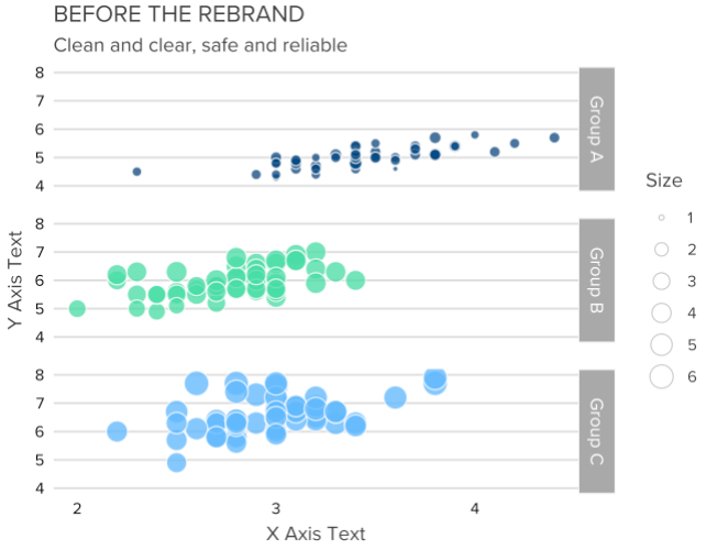
More than anything, a rebrand is a time to think about who you are right now and if that’s coming across adequately to your users. For Trilliant Health, we know that what we offer is provocative, trustworthy and bold—and that we’re filling our shoes more than ever before. Our old brand didn’t contradict any of those things, but it was safer and more conventional than we really are.
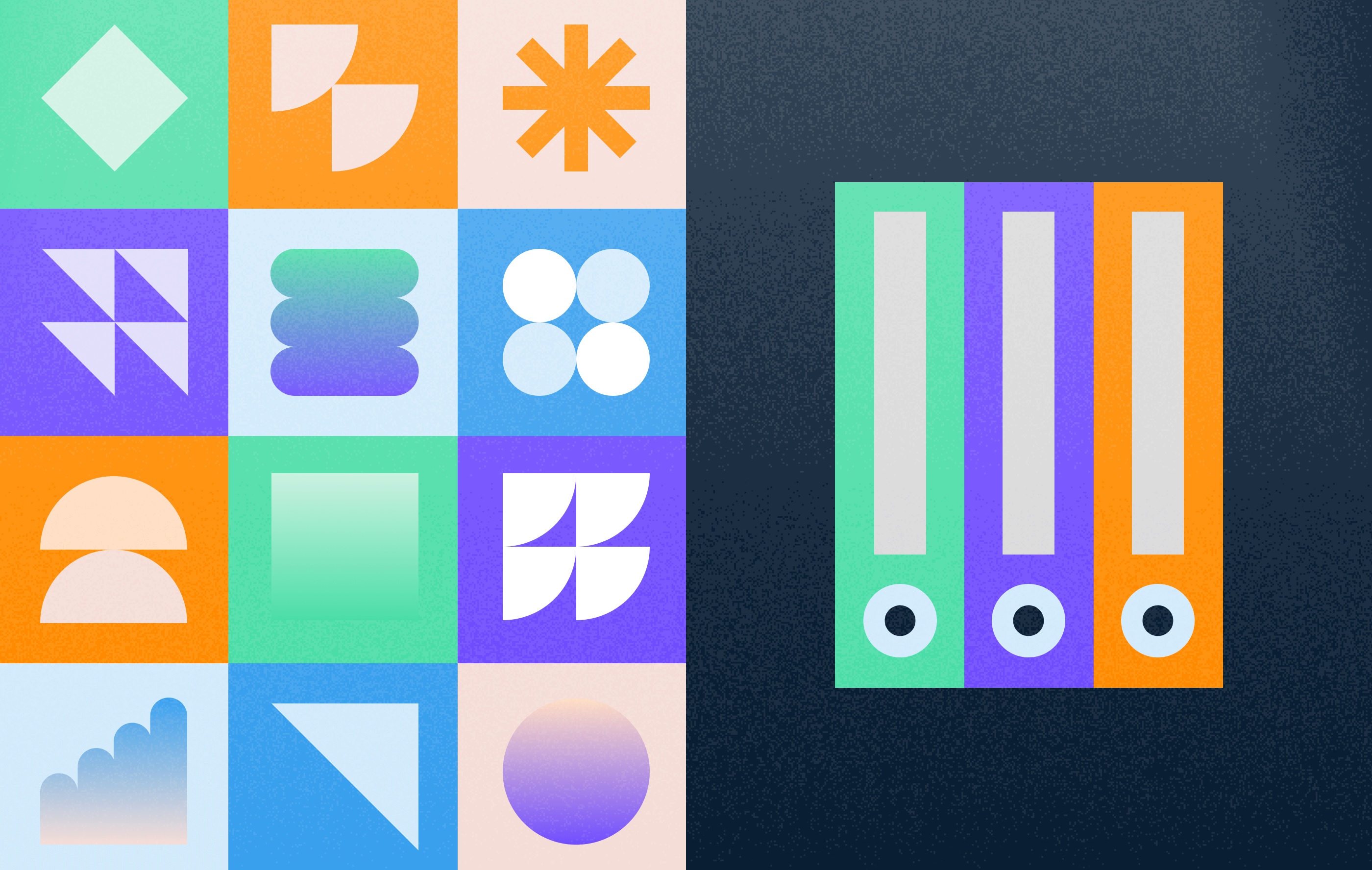
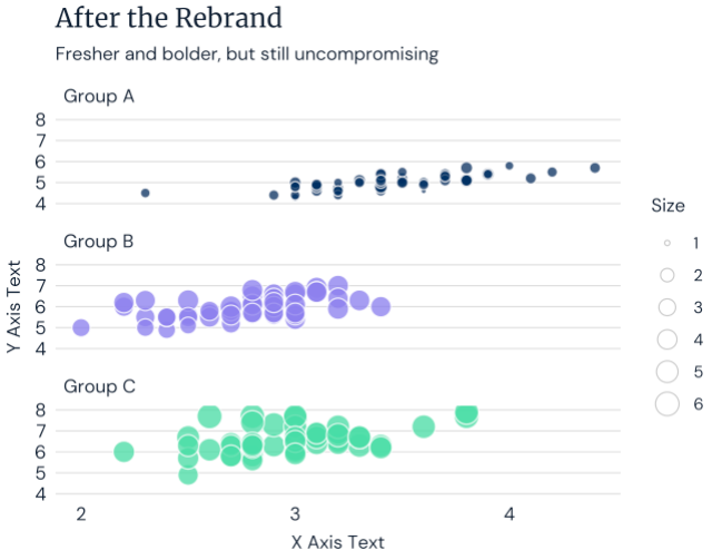
For example, our old color palette relied on more conservative shades of green and blue, all couched in a lower contrast environment with a variety of grays. That certainly read as “trustworthy”, but it didn’t do anything to identify ourselves as bold or provocative. No more! Now, we lead the charge with a signature pairing of electric purple and steady dark blue, punctuated with zings of pink, orange and green. We’re leaning away from gray type in favor of darker, more assertive print. And, for an added touch of authority, we’ve introduced a serifed typeface to pair with our friendlier body text. The result? A visual voice that looks and feels more completely like who we are.
Patch Up “Leaks” in Your New Standards
While you’re already shaking things up, a rebrand is the best possible time to deal with nagging issues from an old set of standards. For us, that meant taking a closer look at the ways that our design system was being used in the real world by our colleagues, and where it was falling short. Originally, we made a conscious decision to give some latitude and creative freedom to the various data visualizers across the company, provided that they design within the spirit of the brand. Telling people how to do their work can be delicate, and building their trust and ownership in our brand was a needed first step. We learned, however, that too much creative freedom can look a lot like providing inadequate support where it’s needed.
Going forward, we decided to be more macOS and less Windows, detailing (and enforcing) a level of specificity that we hadn’t previously. We greatly narrowed the number of choices someone could make, and amped up the documentation on what they should. We took a fine-toothed-comb to the first large deliverables in the new style, and—pardon the metaphor here—nit picked every detail that hadn’t been clarified. The effect is a stronger voice overall and teammates who are less burdened with making design choices on their own.
Revisit Accessibility
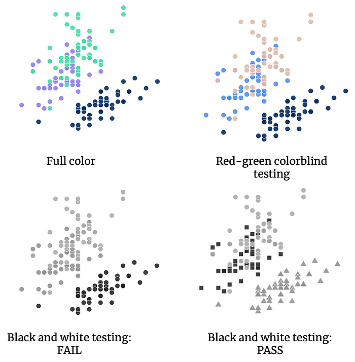
A new brand almost certainly means changes to colors and typography, so you’ll need to double-check that you’re still bringing everyone along for the journey with respect to accessibility. For us, this also meant seizing the opportunity to upgrade our accessibility guidelines to be even more rigorous. We’re doing this by applying what we call a “black-and-white” test to all of our visualizations instead of solely testing the standalone colors for red-green and blue-yellow colorblindness. If something isn’t readable in black and white, we have new allowances for shapes, colors and pattern fills to make it readable. Anything that’s legible in black and white would pass a red-green test anyway… but the opposite isn’t always true!
This switch to black and white testing is a big win in terms of efficiency and effectiveness. Counterintuitively, we can be even more liberal with our color choices because we’ve ensured that there will always be another user-friendly way to access the information. Our teammates have an easier time checking for accessibility, too, because they only have to print or simulate in black and white—or honestly just imagine it. The resulting visuals are even more robust in the real world as well, because everything that makes them accessible on screens will help with dim projector screens or finicky printers.
Resist Old Habits
After many months or years with a certain style, it’s surprisingly hard to move on from it—and this is one of the biggest differences between branding and rebranding. Without a little extra vigilance, you can quickly slip back into the mindset of an outdated brand.
We maneuvered around this in two ways. Firstly, some of our design choices were expressly because they were different from our old brand, even if there wasn’t a hard quantitative reason behind it. This helps us to stay in the mindset of the new look and not backtrack. Secondly, we decided to specifically restrict certain presentations that are too evocative of our older aesthetic—one shade of green, for example, is totally banned from use in isolation. All together, the new look is just so different that it’s less tempting to default to what we know so well. A brand only works if you actually stick to it.
The Things That Don’t Change
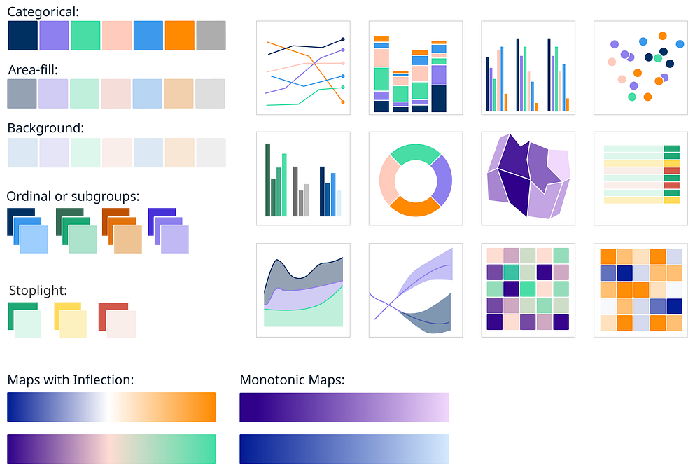
Despite the shift in thinking during a rebrand versus the original branding effort, the fundamentals of a visualization brand stay the same. Technically, that means things like having color palettes for categorical and ordinal data, gradients for monotonic and diverging values, standards for gridlines, axes, legends, and annotations and the resources to make those happen across tools. Operationally, that means leaning into cross-team collaborations to give your colleagues what they need while helping them feel successful and empowered to make awesome visualizations. Finally, it means a willingness to rethink choices that don’t perform and an enduring zeal to educate, educate, educate.
A successful rebrand won’t abandon any of these requirements, nor is it a declaration that anything about your older brand is wrong or bad. Rather, it’s a chance for your business to accept an invitation to a new era—and to dress accordingly. Yes, you’ll have to clean out the closet and make a few trips to Goodwill, but there’s nothing like some clean-closet enlightenment to bring out the best in us all.
- Data Visualization